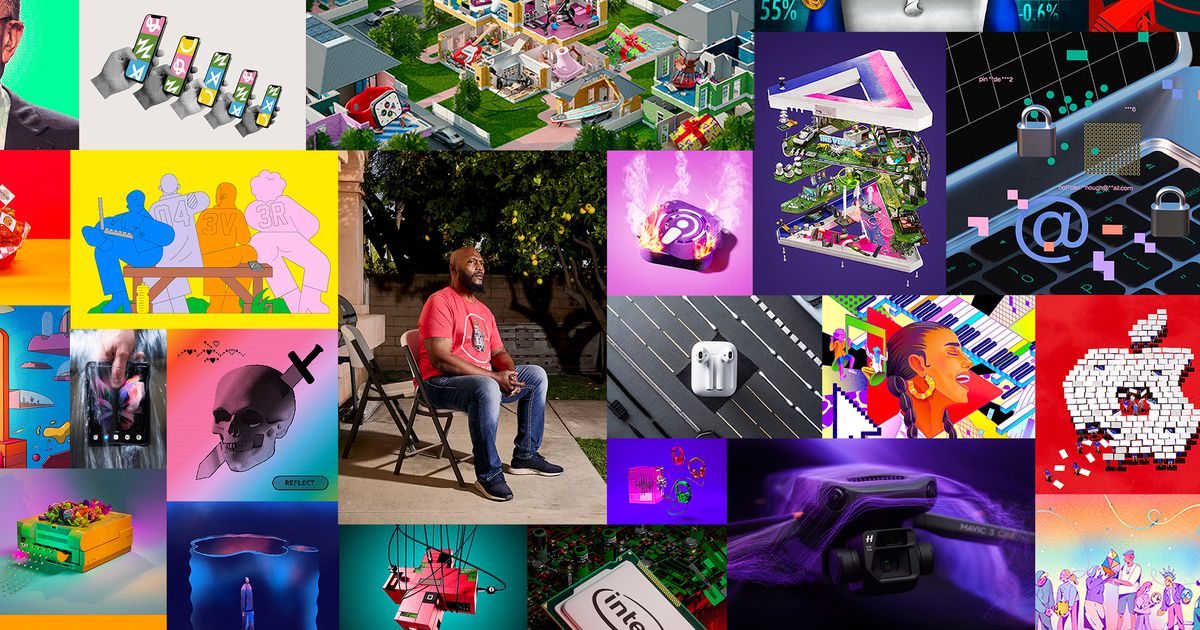
As we near the end of 2021, The Verge’s art team looked back on the past year to reflect on some of our favorite pieces. Our team produced a wide range of original art: from captivating photography of the future of energy, to illustrations representing the last 10 years of The Verge for our anniversary issue, to dozens of stunning shots for our reviews, to a photo shoot of a lot of chicken wings. Below is a selection of our best photography and illustration from our reviews, special issues, gift guides, features, and more.
Verge 10
Illustration by Micha Huigen
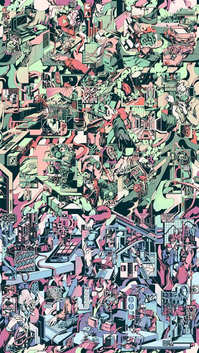
To mark ten years of publishing at The Verge, we looked back on a decade of tech coverage and examined what might come next. Micha Huigen’s art distills this intersection into a single image that resists confining itself to one space. An interlinked canvas of 25 editorial illustrations, which represent all the features in our Verge 10 package, links together into a seamless infinite grid. His surreal illustrations function like scenescapes within which we get to explore close-ups of tiny modular worlds and expansive reimagined realities at once, maintaining a rare analog quality that suggests DIY lithography. (Also, I’m not going to shut up about how we need to wallpaper the whole office in this.) — Kristen Radtke, art director
No adults in the room
Illustration by William Joel
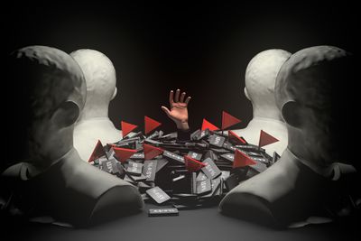
For the lead art, I wanted to find a way to show someone in a situation where they were overwhelmed by the number of inappropriate texts and “flags” while being left helpless by those in a position to do something about it. My initial idea was to make a trail of texts leading the reader on to an ominous ending, but ultimately that didn’t feel strong for the lead art. Instead, I pivoted to a more literal interpretation of being overwhelmed — in this case, drowning in the texts. — William Joel, creative director
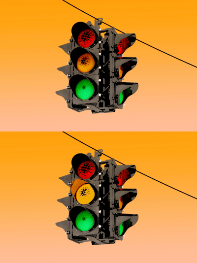
Illustration by Alex Castro / The Verge
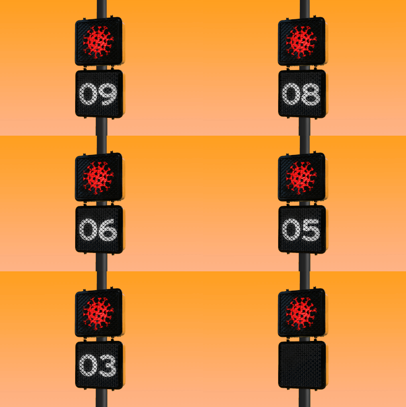
Illustration by Grayson Blackmon / The Verge
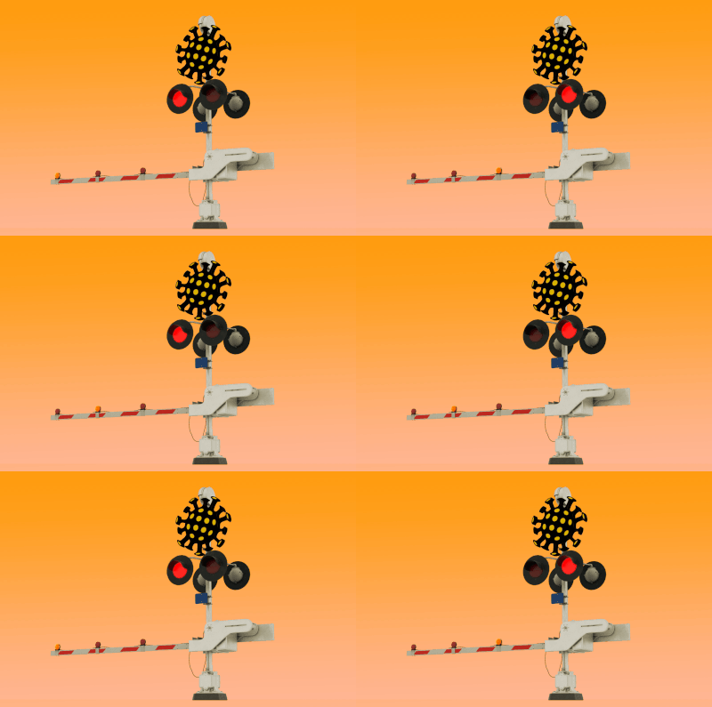
Illustration by William Joel / The Verge
What are we waiting for?
Illustrations by Alex Castro and Grayson Blackmon
This art by Alex Castro and Grayson Blackmon, art directed by Will Joel, speaks to the stalled nature of life during the pandemic so well: traffic lights forever blinking yellow, crosswalks that never complete their countdown, and railroad crossing bars that remain permanently horizontal. The result creates a clear metaphor for the finger-drumming anxiety of the late-stage pandemic. — Kristen Radtke, art director

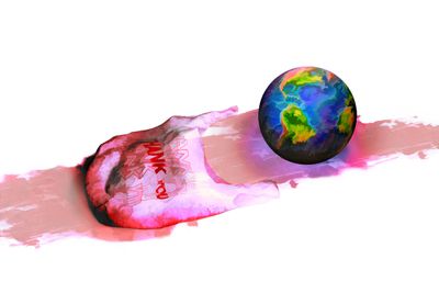
Illustration by Alex Castro / The Verge
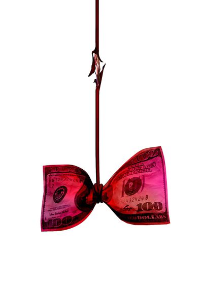
Illustration by Alex Castro / The Verge
Delivery Failed
Illustrations by Alex Castro
Feature artwork for a story on EV startup Chanje. It’s a wild ride that takes the reader through international business drama to a tech CEO cult of personality dynamics. I particularly loved creating the spot illustrations, which were chances to show the wackiness of the story. I would explain more, but you just gotta read the piece; I can’t do it justice. — Alex Castro, illustrator

Photo illustration / The Verge

Photo illustration / The Verge

Photo illustration / The Verge
The great wings rush
Photo illustrations by Alex Castro, Amelia Holowaty Krales, Grayson Blackmon
Delivery-only “ghost kitchens” exploded during the pandemic, so we invented a bunch of our own for this story about virtual chicken wing brands. We repackaged wings that we purchased from ghost kitchens (plus a little extra sauce) to nod to the consumer deception and acknowledge the humor of it all. This was a collaborative effort of the entire art team — and the first opportunity to work together in person after over a year on Zoom. — Amelia Holowaty Krales, senior photo editor
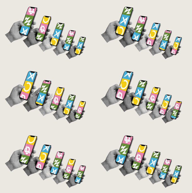
Illustration by Tyler Comrie
Where did the microchip vaccine conspiracy theory come from anyway?
Illustrations by Tyler Comrie
Out of all the sketches Tyler shared, these resonated immediately. In part because it feels like doomscrolling — a constant in our lives thanks to COVID — but also because it felt so tied to the passive nature of people seeing some meme on a social feed and just believing it without any validation. That seems to be how so many of these lies spread so easily: there’s no fact-checking, just scrolling, ingesting, and… repeat. — William Joel, creative director
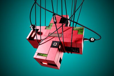
Illustration by Alex Castro / The Verge
The pandemic showed that Big Tech isn’t a public health savior
Illustration by Alex Castro
To accompany a story about tech companies’ involvement with public health during the pandemic, this illustration by Alex Castro looks, on first glance, as though the health cross is being supported by the cables that suspend it. But upon closer inspection, the cables are plugged into the object’s unprotected areas, turning support into entrapment. I love everything Alex makes, and his art has become synonymous with the visual sensibility of The Verge. — Kristen Radtke, art director

Illustration by William Joel / The Verge
How Boosted went bust
Illustration by William Joel
I wish I could take more credit for the concept here, but there was a perfectly succinct line in the story that I knew would become the art the moment I read it: “…Boosted is dead, the beloved electric skateboard startup’s carcass is still drawing buzzards.” — William Joel, creative director
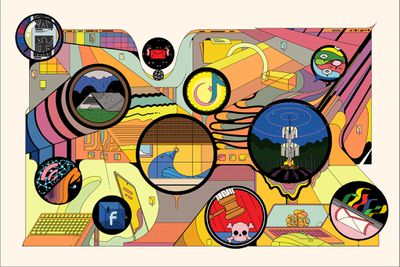
Keep It Locked
Illustrations by Ori Toor
I’ve admired Ori Toor’s bizarre and gorgeous illustrations for a long time, so I was thrilled when he came on board to draw the art for our security week package. The circular elements speak to each individual story, and while they’re each unique in their styling, they speak cohesively to each other just as well. I love to take an illustration apart in some way, pulling out elements and making them interactive. — Kristen Radtke, art director

Photo by Avery White for The Verge
Power Shift
Photography by Avery White
As a documentary photographer based in New Orleans and a person passionate about climate justice, Avery White brought so much to these photographs and this project in general. Avery spoke to so many different people wherever she went, and that curiosity and compassion shines through in these images. The process from start to finish with Justine and Avery was really collaborative and inspiring. — Amelia Holowaty Krales, senior photo editor

Illustration by Alex Castro / The Verge
The summer Intel fell behind
Illustration by Alex Castro
I wanted to show that Intel isn’t fully out of the game, but its future is uncertain. It has a plan, but time will tell if it delivers. — Alex Castro, illustrator
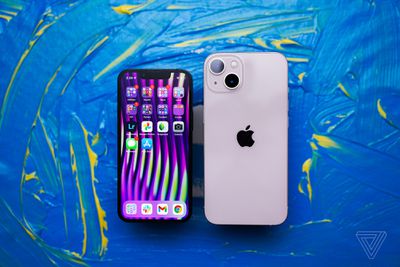
Photo by Vjeran Pavic / The Verge
iPhone 13 review
Photography by Vjeran Pavic
Videographer and photographer Vjeran Pavic photographed the iPhone raised above these hand-painted panels. The color contrast and the texture of the paint against the phones created a really dynamic set of photos. — Amelia Holowaty Krales, senior photo editor
The mess comes home
Illustrations by Thomas Hedger
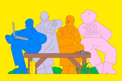
This feature about how some staffing firms are hiring — and immediately benching — new employees is a weird, wild ride, and Thomas Hedger’s art perfectly mirrors that strangeness. I particularly love his attention to hands, which plays on the “idle hands” cliche. — Kristen Radtke, art director
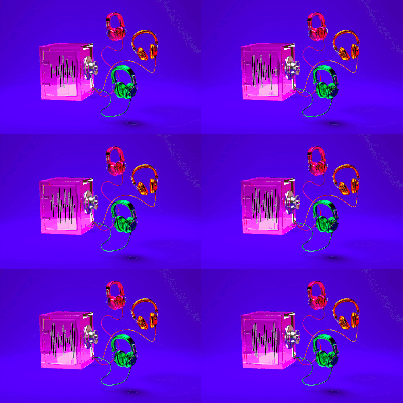
Illustration by Grayson Blackmon / The Verge
A podcast app is exposing subscribers-only shows
Illustration by Grayson Blackmon

Illustration by Richard Parry
The Verge Holiday Gift Guide 2021
Illustrations by Richard Parry
This year’s suite of gift guides was the largest The Verge has ever done, so we turned to artist Richard Parry, who’s a master at creating expansive worlds. Each individual guide is represented by a single room, which build together into a neighborhood stuffed with oversized objects. The products are both whimsical and at home in their spaces — it almost seems natural to strap a surfboard that’s three times the size of a car to the roof of a sedan. — Kristen Radtke, art director

Photo by Dieter Bohn / The Verge
Samsung Galaxy Z Fold 3
Photography by Dieter Bohn
I love this photo that Dieter took for his review of the Z Fold 3. Even though water-resistant phones are common now, I still have a gut reaction of dread when seeing a phone in water, and that drama adds to the image. The blur from a long exposure, which captures the movement of the water around the phone, is really what does it. — Amelia Holowaty Krales, senior photo editor

Illustration by Alex Castro / The Verge
Apple’s attempt at podcast subscriptions is off to a messy start
Illustration by Alex Castro
This story was about the messy backend of Apple’s new podcast subscription feature. I wanted to communicate that what was broken underneath the surface ends up coming to light and impacting the user and creators. I took some inspiration from another Apple product, the Mac Mini, and mimicked it’s internals for the layout of the circuit boards, which I ended up hiding with flames. A waste of time? Never! — Alex Castro, illustrator

Public transportation can save the world
Photography by Kelsey McClellan, Annie Mulligan, and Annabelle Marcovici
For Andrew Hawkins’ story about the future of public transportation, we wanted to get a snapshot of the people who utilize these important systems everyday. We were looking for the busy and quiet moments in a street photographer style. In Houston, Minneapolis, and San Francisco, Kelsey McClellan, Annie Mulligan, and Annabelle Marcovici took some great frames, including looped video which we used as “moving pictures.” It was a really fun piece to put together. — Amelia Holowaty Krales, senior photo editor

Illustration by Rebekka Dunlap
Grassroots online efforts are forming a new queer network of care
Illustration by Alex Castro
For this illustration it was very important to show the network of care in action, and the diverse cast of characters that make them up. Rebekka Dunlap did an excellent job representing the community and making it vibrant and fun. — Alex Castro, illustrator

Illustration by Alex Castro / The Verge
Spotify’s latest purchase is about becoming the place you listen to everything
Illustration by Alex Castro
A quick illustration that I love mainly due to its simplicity. Made for a piece on Spotify’s acquisition of an audiobook company, I wanted to construct waveforms using books — so after a few iterations, I focused on the Spotify logo, which in its own way reflects waveforms. I originally had the books more digitally stylized, but a note from our art director Kristen moved it into a more realistic space, which really sold it. — Alex Castro, illustrator
What The Verge covered in our first 120,000 stories
Art and design by Kristen Radtke
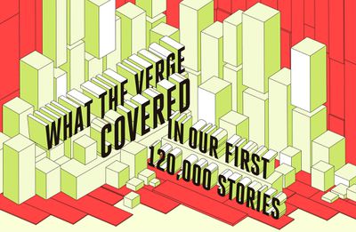
This is one of the first longform pieces I worked on since joining The Verge, and it’s a story of how the technology industry evolved over the last decade — companies tangled over high-stakes lawsuits, powerful new figures reshaped how we communicate, companies rose and fell competing over slivers of market share. The illustrations that make up this story exemplify what The Verge does best: break down seemingly complicated information into digestible bits. — Kristen Radtke, art director

Photo by Amelia Holowaty Krales / The Verge
The Sacking of a crypto mecca
Photography by Amelia Holowaty Krales
I accompanied Russell Brandom to Keene, New Hampshire, which is home to a small Bitcoin economy. This story begins with an FBI raid of Free Talk Live radio host Ian Freeman’s home and studio, where we photographed and interviewed him. — Amelia Holowaty Krales, senior photo editor

Illustration by Alex Castro / The Verge
Apple’s fortress of secrecy is crumbling from the inside
Illustration by Alex Castro
This was a big investigative feature from Zoe Schiffer about Apple’s company culture shifting from one of locked down secrecy to frequent open dissent. Now, more than ever, Apple employees felt empowered to stand up for themselves and their colleagues. This image came to mind very quickly when reading the piece. It was clear that Apple’s public image was held up by its employees, and it falls apart when they decide to make a change. A specific detail I wanted to show was people empowering others through their choices and employees considering what they’ll do next. — Alex Castro, illustrator
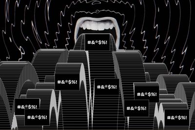
Illustration by William Joel / The Verge
Timnit Gebru was fired from Google — then the harassers arrived
Illustration by William Joel
Not long after leading AI researcher Timnit Gebru was fired from Google, she became the target of a campaign of harassing tweets. Gebru and others suspect that some of these came from sock puppet accounts. I wanted to illustrate a seemingly never-ending barrage of toxic tweets or messages from a single source. I tried making this completely in After Effects but wasn’t loving how the solitaire effect was looking, so I pivoted to using some JavaScript and then taking that animation back into After Effects to edit it to loop perfectly. — William Joel, creative director

Laserwriter
Photography by Amelia Holowaty Krales and Kristen Radtke
To accompany this excerpt from Tamara Shopsin’s novel about an early ‘90s Mac repair shop, we worked to create a visual metaphor for how the once cutting-edge LaserWriter II printer compressed images and text to produce clear prints. We represented this compression with rows of seeds that we meticulously affixed to transparent sheeting, arranging flowers at the opening of the output tray. We mimicked the color of the flowers with lighting and pulled the gradient through the page design to create a cohesive, playful package. Sourcing the 36-year-old printer was a challenge — the eBay seller seemed quite confused about why we wanted it so badly. Amelia set up eight lights with colorful gels, and the result is sexy and weird — the hardest part was figuring out how to get the contact paper to stick to the printer. — Amelia Holowaty Krales and Kristen Radtke
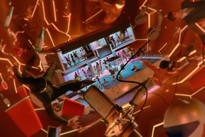
Illustration by Alex Castro / The Verge
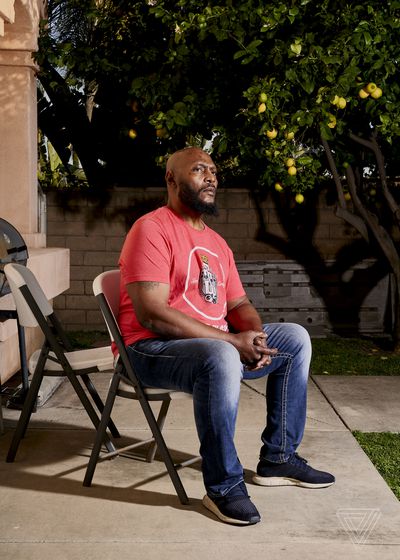
Photo by Philip Cheung for The Verge
The podcasting hype house from hell
Illustrations by Alex Castro, photography by Philip Cheung & Richard Vogel
This is an absolutely bonkers story literally about sex, drugs, and podcasting. A house rented in Beverly Hills meant to be a creative hub for podcasts was crushed under its weight and turned into a mismanaged party house. This story already had a great deal of strong visuals. Philip Cheung’s photography of Norm Steele is seriously stunning. Richard Vogel’s photos paint such a vivid picture of what a party at the house is like. We had decided early on we wanted an illustration, however, as the lead art. While we had the idea of showing the house falling apart, it took a few iterations and changing of hands to really capture the tone correctly. Ultimately, Alex Castro did such a fantastic job, especially with the additional illustrations in the body of the article. — William Joel, creative director
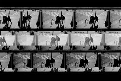
Photo illustration by William Joel / The Verge
The unsettling surveillance of anti-Asian racism
Photo illustration by William Joel

The worst gadgets we’ve ever touched
Illustrations by Alex Castro
This piece brought together all the disappointments, duds, and flight risks of the decade. I decided to go with a low poly PS1 look to emphasize the low-quality nature of these products — and because it tends to look pretty funny. Initially only the Note 7 was going to be on fire, but that eventually spread to the whole dumpster. It became a dumpster fire, if you will. — Alex Castro, illustrator
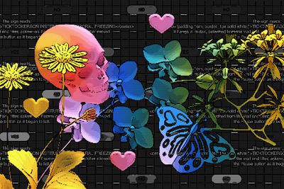
Illustration by Maria Chimishkyan
Text Adventures
Illustrations by Maria Chimishkyan
Maria Chimishkyan’s 8-bit, lo-fi approach for the art beautifully captures the feel of Twine games and how unique they are. So many Twine games are text focused, so each illustration included its own ascii art and a button. — William Joel, creative director

Photo by Vjeran Pavic / The Verge
DJI Mavic 3 review
Photography by Vjeran Pavic
For the DJI Mavic 3 review, Vjeran Pavic photographed the drone in a studio with only one strobe flash and a long exposure. I was really surprised to learn that he used this thing for the colorful lights. — Amelia Holowaty Krales, senior photo editor

Illustration by Alex Castro / The Verge
A recall of Philips respiratory devices has left users stranded
Illustration by Alex Castro
For this illustration on a story about CPAP machine recalls, I wanted to communicate the desperation and anxiety of someone who is so close but so far from getting the assistance they need and the cruelty of companies that can’t figure out how to give it. — Alex Castro, illustrator

Illustrations by Jesse Zhang
Apple’s frontline employees are struggling to survive
Illustrations by Jesse Zhang
Jesse Zhang is the first artist I think of when we need emotive art with a clear argument: her work is both sharp and soft, and her palettes are something to live inside. For a piece about an Apple employee’s tragic death, it was particularly important that the work be both elegiac and disrupt expectations around how tech is often represented visually. — Kristen Radtke, art director

Photo by Chaim Gartenberg / The Verge
Amazon Kindle Paperwhite (2021)
Photography by Chaim Gartenberg

Illustration by William Joel / The Verge
Can anyone moderate podcasts?
Illustration by William Joel
This report from Ashley Carman covers how difficult and nuanced it is to moderate podcasts, and how that is a growing issue for a number of companies. In particular, Apple seems to have taken a different approach than others by not removing some content. I wanted to make an image that simply illustrated toxic audio that was a growing issue. It’s not the first time I’ve turned to emoji in our art to try to sell a tone quickly, but given the connection to Apple with podcasts it made sense! — William Joel, creative director

Facebook papers
Illustration by Alex Castro
This was the lead image for our big takeaways from the Facebook Papers leak. The key takeaway from our team was that, as much as Facebook likes to keep its public face clean, the facade was crumbling. I wanted to emphasize the mess it’s made and the mechanical complexities of what lies beneath the surface. — Alex Castro, illustrator

Illustrations by Michelle Rohn
Welcome to the stonk market
Illustrations by Michelle Rohn
When I showed an early sketch by Michelle Rohn to Elizabeth Lopatto, this piece’s writer, I asked Liz if she thought it was too weird — and Liz said there was no such thing. She’s right, which is why I work with both of them every chance I get. I still can’t get over the pear in place of the Apple logo. — Kristen Radtke, art director

Photo by Amelia Holowaty Krales / The Verge
Inside the IRL Clubhouse house party
Photography by Amelia Holowaty Krales
This was the first public event I photographed after the height of the pandemic, and I had the sense this was one of the first post-vax events for others as well — everyone was very excited to be there. Like Ashley mentioned in the story, it seemed like a reunion of old friends even though most people had never met in person. There were a lot of interesting details in the room, and I used a direct flash to try to accentuate the vibrancy and the party vibe. — Amelia Holowaty Krales, senior photo editor
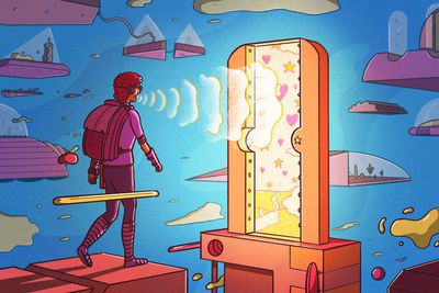
Illustration by Laurent Hrybrk
When games are hard on their hands, some players turn their voices into controllers
Illustration by Laurent Hrybrk
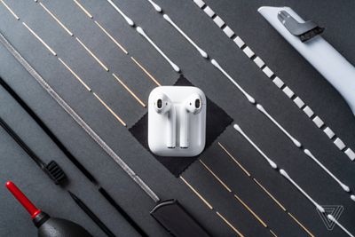
Photo by Antonio G. Di Benedetto / The Verge
How to clean your earbuds
Photography by Antonio di Benedetto
The images that Antonio di Benedetto took for his “How to clean your earbuds” story were so precise and wonderfully done; it was an unexpected way to illustrate the topic. — Amelia Holowaty Krales, senior photo editor
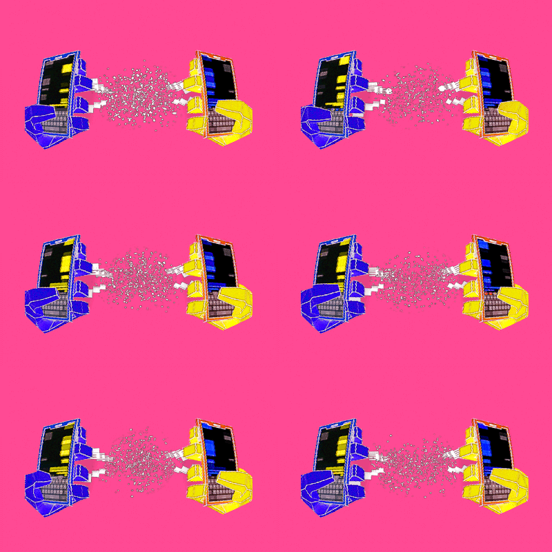
Illustration by Alex Castro / The Verge
Let’s chat about RCS
Illustration by Alex Castro
A very quick illustration that I’m very happy with for a story on RCS messaging. It’s not the most exciting of topics, so it was a challenge to make this fun. I centered the art around the idea of messaging and encryption. — Alex Castro, illustrator

Illustration by William Joel / The Verge
Apple’s $64 billion-a-year App Store isn’t catching the most egregious scams
Illustration by William Joel
This feature from Sean Hollistor about app developer Kosta Eleftheriou finding scams in Apple’s App Store is a great and frustrating read. In it are many examples of scammy apps, like a call recorder app that charges $9.99 a week, doesn’t work, and users complain they can’t figure out to how unsubscribe from — but it also somehow has a great rating and review. The goal for the art was to simply illustrate an app store filled with “scams,” and my initial sketch of just making the App Store logo out of a skull emoji seemed to speak to the dangerous state of the platform. — William Joel, creative director

Photo by Amelia Holowaty Krales / The Verge
Nreal Light review: Hardware is only half the battle
Photography by Amelia Holowaty Krales

Reflecting on 10 years of The Verge
Illustration by Richard Parry
In November, The Verge turned ten. To coincide with our birthday we commissioned a special piece of art from Ricard Parry to capture the past ten years of The Verge. Parry’s work is so detailed and well thought through. It was a pleasure talking through what products to add and how to tie them in. — William Joel, creative director

Photo by Jeremy Bali for The Verge
Can Clubhouse keep the party going?
Photography by Jeremy Bali
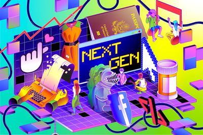
Illustration by Ari Liloan for The Verge
Next Gen
Illustrations by Ari Liloan
This was such a fantastic series to work on. I had the pleasure of working with the amazing Ari Liloan on these illustrations. We had a total of ten stories, but four of those were from young authors themselves and so we wanted to create a mosaic linking those four stories together. Liloan did an incredible job melding those stories into a single connected image. — William Joel, creative director

Illustration by Grayson Blackmon / The Verge
How the USPS mail trucks could still go fully electric
Illustration by Grayson Blackmon

Illustration by Alex Castro / The Verge
The grid needs to smarten up to reach clean energy goals
Illustration by Alex Castro

Photo illustration by William Joel / The Verge | Photo by Tasos Katopodis / Getty Images
Chuck Schumer wants to replace every gas car in America with an electric vehicle
Illustration by William Joel
It might be obvious, but this one isn’t very deep: I read the line saying Schumer’s “goal is to have every car manufactured in America be electric by 2030,” and the idea to have the illustration be a bit extreme seemed obvious. That said, I am extremely happy with how this turned out. — William Joel, creative director
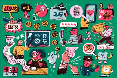
Illustration by David Huang
All the best emails from the Apple vs. Epic trial
Illustrations by David Huang
David Huang is great at this kind of compilations of moments. He made this piece for our story on the biggest takeaways from emails made public during the Epic v. Apple trial. There’s no heavy central visual to the illustration, which is something I tend to have often in my work. This is something that challenged me when art directing, as I had to fight my impulse to bring everything together and allow things to sprawl out. David did an incredible job. — Alex Castro, illustrator
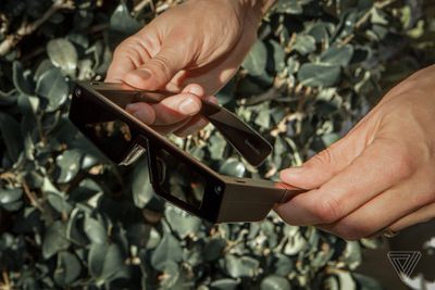
Photo by Amanda Lopez for The Verge
Snap’s first AR Spectacles are an ambitious, impractical start
Photography by Amanda Lopez

Illustration by Maria Chimishkyan
Lock it Down
Illustrations by Maria Chimishkyan
Another amazing project working with Maria Chimishkyan. For this project, we needed a style to use across a series of privacy-related stories and a landing page. Working with Chimishkyan, we landed on each illustration incorporating some type of data elements relating to each story, as well as a mix of expressive and UI-esque dimensional strokes or line work. That combined with her 3D style gave us a series of fantastic illustrations that feel both unique and themed to this series. — William Joel, creative director
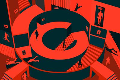
Illustration by Alex Castro / The Verge
Google is poisoning its reputation with AI researchers
Illustration by Alex Castro
This was for a story about AI researchers at Google being silenced when pointing out the wrongs of Google’s programs. The job they were hired to do was being sabotaged, leaving them confused and lost. I was inspired by M.C. Escher’s famous labyrinth drawings. I wanted to visualize the difficult task of navigating the internals of Google and the ethics they’ve sworn to uphold. Which way is up, which way is down? — Alex Castro, illustrator

Photo by Chris Welch / The Verge
The Samsung Galaxy Buds 2
Photography by Chris Welch

Illustration by Alex Castro / The Verge
How to sneak into a Bored Ape Yacht Club party
Illustration by Alex Castro
Source: The Verge


